Adding Patterns
The menu bar of the What You See Is What You Get (WYSIWYG) provides numerous options for adding simple and complex patterns. Using these design elements along with the guidelines of the Foundation will ensure our website is consistent and effective. Do not add custom CSS, fonts, or type sizes.
Top Level WYSIWYG
When in edit mode, the top row of the menu bar offers several formatting choices.
- Bold
- Italics
- Bullet and Numbered List
- Super Script and Sub Script
- Links
Text Hierarchy Drop-Down
On the second row of the WYSIWYG, use the drop down on the left to adjust the text hierarchy.
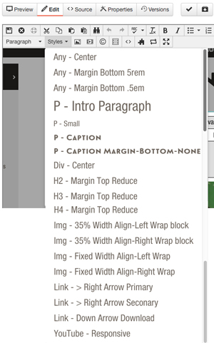
Styles Drop-Down
On the second row of the WYSIWYG, use the Styles dropdown list to apply a special
class to a specific element, by highlighting the element and selecting the drop-down
style. All options are preceded by the element they're recommended to be used on,
eg. "P - Intro Paragraph" recommends you apply the class "intro-paragraph" to paragraph elements.
View which styles are applied by selecting the text and then selecting the Styles drop down. Active styles have a gray highlight on the left. Selecting an active style will deactivate it.
The Styles drop down offers numerous options including spacing and alignment.
Images and Video
On the second row of the WYSIWYG, use the image and video icons to add or edit images and videos.
Special Characters
On the second row of the WYSIWYG, use the © icon to insert a special character. This is particularly useful for smart quotes.
Snippets
Snippets are starter content that can be inserted and then edited. Generally, snippets have designed content with filler text.
Components
Components are forms that are filled out and then transform into more complex patterns.
Assets
Assets are centrally managed content that can be inserted. Update the asset and all instances will be updated. Assets can be plain text, designed text, or code.
Contact the Web Team if you are regularly using identical copy.