Snippets
Snippets are starter content that can be inserted and then edited. Generally, snippets have designed content with filler text.
Instructions
- In WYSIWYG, select the puzzle piece on row 2
- Select from list and snippet will be added to the content
- Edit snippet to customize for the specific situation.
Table Transformations
Some snippets use table-transformations. The user fills in content inside a simple table and upon preview the table is transformed into a design pattern utilizing the content. To add an additional item, add a new row to the table.
Snippet Menu
| Snippet Name | Description | Comments |
|---|---|---|
| Accordion | Collapsing boxes with hide/show content under headlines |
Use accordions to make headlines easy to navigate while hiding text underneath. |
| Arrow List | Styled <ul> |
Pre-styles ul, li listing with arrows instead of circles. |
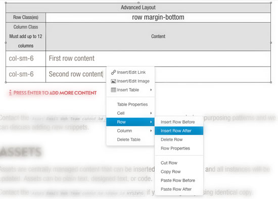
| Basic Layout | Bootstrap grid conversion for the WYSIWYG |
Similar to Columns, however you cannot edit the class on the main "row" div using this snippet. Snippet takes in the column class and content. Creating a new row will allow you to add multiple columns, however the columns make use of the Bootstrap grid, so all of the column classes must add up to 12. |
| Boxes - 3 color boxes | Colored Info boxes as seen on the campus-landing template |
Add class and the content. Box color is determined by the css. Only the first three rows of the snippet will display. |
| Campus Map | Map widget for map page |
Add location name, latitude and longitude, z-index, image, description and link. Adding a new row will allow you to add a new location to the map. Removing a row will remove the location from the map. |
| Centered Text | Centers text |
Table Transformation. Wraps table contents in "div.text-center". |
| Column Photos Column Text | Left column image and right column text |
Left column image and right column text |
| Column Text Column Aside | A column of body text and a tangential box for links. |
A column of body text and a tangential box for links. |
|
Column Text Column Sidebar |
Bootstrap grid conversion for the WYSIWYG Incudes text in one column and a sidebar with gray background in the other column |
Snippet takes in the class(es) for the "row" div. It takes in the "column" class(es) and it takes in the column content. Creating a new row will allow you to add multiple columns. Columns make use of the Bootstrap grid, so all of the column classes in a table must add up to 12. Any new rows will be added inside of the main "row" div. |
| Columns | Bootstrap grid conversion for the WYSIWYG |
Snippet takes in the class(es) for the "row" div. It takes in the "column" class(es) and it takes in the column content. Creating a new row will allow you to add multiple columns. Columns make use of the Bootstrap grid, so all of the column classes in a table must add up to 12. Any new rows will be added inside of the main "row" div. |
| Course | Formatted block of text |
Name/Header, Code | Faculty | Credits, Text Block, Small Text |
| Full Width Block (Div) | Basic div with content | Create a div structure with a class and add content within div. Unlike the Column layout this snippet will only create a single div with content. |
| Hero Button | Red button on top of image or video | Add button text and link. To make the button open in a modal set the link to “#” and include the modal snippet in the same hero editable region. Adding a new table row will create multiple buttons, so for three buttons create three table rows in one button snippet. |
| Hero Image | Large background photo at the top of a page | Add title, content, buttons, image class, a main image, and a large image. Use hero buttons snippet for adding button to a hero image. The snippet will appear by default in the Hero Image Editable Region. |
| Hero Modal | Add a video modal to a hero button. | Add title, video source (hosted, or iFrame), and the modal call to action button. |
| Hero Video | Add a video to hero region on top of page | Add title, content, buttons, video source and video image class. Use the hero buttons snippet for adding buttons to a hero video. This snippet will appear by default in the Hero Video Editable Region. |
| Homepage News | News content for the home page. | News content for the home page. |
| Icon Nav | Icon and text in a bar | Create an icon nav bar as seen on the master section landing page. Snippet takes in the icon class, text and link. |
| Image Carousel | Rotating image carousel | Rotating carousel as seen on the student life page. Add image, text and link. The class for the image is built by XSL using the title. |
| Image List Selection | Image list selection as seen on the gateway template | Add title, image, content and link. Content section is prepopulated with another two-column snippet that builds the two-column layout. |
| Link Large Red Arrow | Large red arrow link | Use to call attention to a link. More important than a regular link, less important than a button. |
| Link Medium Red Arrow | Medium red arrow link | Use this in aside boxes |
| Link Small Red Arrow | Small red arrow link | Use this under red buttons |
| Links - 4 Circles | Add up to 4 circle links to page | Ability to add the circles as seen on the giving landing page. Snippet takes in the circle class color, the title and link. Only the first four circles in the snippet will display. |
| List - Contacts | As seen in bio lists | Use when list has header and subparts |
| List - Numbered Circles | Numbered <ol> style | Pre-styled ol, li listing with numbered circles instead of plain numbers. |
| Images - 2 with no gutter | Project image group as seen on the profile template | Add two images. Content below the images is placed outside of the snippet. |
| Image Full Width with Caption | Thumbnail images as seen on the profile template | Add image, title, and additional text. Text classes are available in the styles dropdown menu. |
| Pull Quote | Styled pull quote | Use pull quotes to break up text |
| Pull Quote (long) | Styled long pull quote | Pull Quotes longer than 3 lines |
| Pull Quote (no side margin) | Removes margins from pull quote | Use when pull quote is within a column. |
| Red Button | Red button link with white text | Add button text and link. To make button open up to a modal set the link to be “#” and include the modal snippet in the same editable region. Adding a new table row will create multiple buttons, so for three buttons create three table rows in one button snippet. |
| Red Button- Center | Same as above but centered | Same as above but centered. |
| Slideshow | Collapsing boxes with hide/show content under headlines - 2 columns | A tabbed panel slideshow snippet that has a title and content. If adding an image and a caption make sure to use the styles dropdown to add the accordion image class to the image, and the accordion text class the caption. |
| Table | This info is in a table | Pre-styled table with all necessary classes as seen on the mixed-media page. |
| Images - 3 with 3 captions | 3 images with cations as seen on the giving landing template. | Add section heading, image, link, and caption. Only the first three items of the snippet will display. |
Contact the Web Team if you are regularly repurposing patterns and we can discuss adding new snippets.