- Home
- Guide
- Foundation
- Design
- Calls to Action (CTAs)
Calls to Action (CTAs)
Calls to action are a vital part of the primary goals of the website to increase enrollment, build relationships and strengthen the College's fundraising efforts.
There are a variety of styles of CTAs to choose from. Please refer to this guide when deciding which style CTA to use to support your content.
For technical instruction on how to create CTAs, please visit the Patterns section of the guide.
Red Buttons
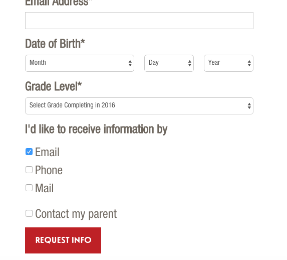
Used for most important site goals: Apply, Visit, Request Info, Talk to a Student, Anytime we link to a form. The Button CTA is always short and scannable. It has a black hover state. In most instances, it is centered below the appropriate content.
Primary site goals = Red Button
Examples of Red Button CTAs
Do
- select the appropriate button from the assets library. They are pre-formatted and ready to use.
- use with one or two Small Red Arrow Link as necessary.
- use up to three buttons on top of hero images. But try not to dilute the message.
- place buttons on top of an image, on a colored background, inside an aside box, on a form, or stand alone.
-
center the button(s). One exception is on forms, where they are left aligned.
Don't
- manually create variations of the Button CTAs that exist in the assets library using the snippet library.
- over-populate page content with Button CTAs.
- use other CTA styles with the Button other than the Small Red Arrow Link.
- use a button with small red arrow link(s) on top of an image or hero.
Visual examples of correct Button usage


Small Red Arrow Link
Always nested below the Button and directly related to Button. When the Button seems too overbearing and distracting this style may be used as a more subtle CTA. It can also be used next to the Button link style as a way of showing that it is not as important as the Button link.
Examples of Small Red Arrow Link CTA
Do
- use this if it feels like it conflicts with other CTA’s on the page
- use with a button
- make sure to center
- put multiple Small Red Arrow CTAs on same line
Don’t
- use without a Button
- use this in body copy

Large Red Arrow Link
(red bold type with red arrow. The largest of the red arrow links)
Use the link when there are one or two primary calls to action on a page that is not one of the regular buttons listed above. Use the large red arrow link to drive people to pages that will help them experience the best of Simon’s Rock and move them through the funnel.
Example of Large Red Arrow CTA
Do
- use for longer calls to actions that aren't Button CTAs.
- format as a 'DIV.'
- try to keep the length of the link to no more than four words.
- use only one or two on top of each other.
Don't
- use under or adjacent to a button.
- format as 'paragraph.'
- use for links that steer users away from a website goal or conversion, use the custom unordered list instead.
- use these links in aside boxes, use the medium red arrow link instead.
- use next to or under headers.
- use three or more on top of each other.
- use in hero.
- use under or adjacent to an image.
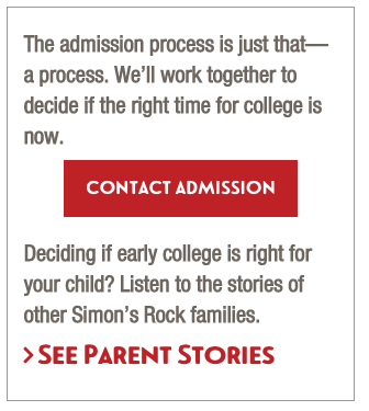
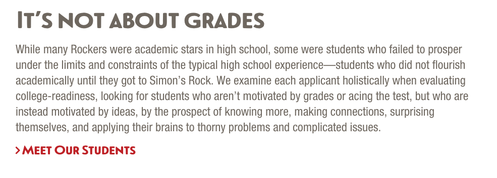
Visual examples of large red arrow links
Medium Red arrow Link
There is also a medium red arrow link for longer text connected to a CTA but that is not linearly connected to the rest of the copy.
This is an example of a medium red arrow link used in an Aside Box. Only use Medium Red Arrow Links in aside boxes, under images or adjacent to images.
Advanced: Right Arrow Primary
Create a right arrow primary link that deviates from the established code pattern. Create a link with class right-arrow-primary-custom and the class will be replaced with right-arrow-primary. No other changes or insertions will be made. Use for creating links that have line breaks, such as application deadline, or other deviations. Add the font-awesome > and aria tags using source code.
<a class="right-arrow-primary-custom" href="/academy/apply-to-bard-academy/index.php"><i class="fa fa-angle-right bold" aria-hidden="true"></i> How To Apply<br/>Application Deadline: January 15</a>
XSL translates to
<a class="right-arrow-primary" href="/academy/apply-to-bard-academy/index.php"><i class="fa fa-angle-right bold" aria-hidden="true"></i> How To Apply<br>Application Deadline: January 15</a>

