Templates Overview
Website templates ensure consistent design and use. Pick the template that matches your content needs and use case.
Mixed Content
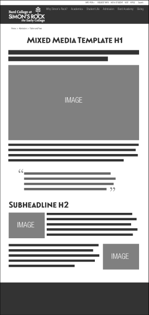
The Mixed Content template is the most flexibly designed template. It rarely appears as an upper level page and makes up almost all of the lower level pages. The template has a WYSIWYG edit field and should be customized to fit what’s needed—the page could be a longer article, or include a number of images and media. Use this template for pages that have LDP Forms. This template is also used for the bio sub-template, see below.
In general, a typical layout for the Mixed Content template would be as follows:
- Centered H1 header
- Followed by one or two sentences of intro paragraph copy (can be preceded by H2),
- Full width image
- Then body copy set in paragraph style.
Document Title
The top of the page display of the Document Title can be toggled off with a page parameter. This is useful on pages where media should be displayed first.
Main Navigation
Navigation style can be toggled with a page parameter. The Full is the default navigation found throughout the site.
Use Minimal Navigation on landing pages with lead generation forms. This reduced nav limits the choices and distraction so that the user focuses on completing the form. Industry tests as well as tests on simons-rock.edu show that this can be an effective tool.
When minimal navigation is toggled on, then main content is full-width - with no side margins.
Breadcrumb
Turn of display of breadcrumbs with a page parameter. Breadcrumbs appear towards the top of the page and show the structure of the page. For example:
Turn off breadcrumbs on pages with lead generation forms that use the Full Navigation. This
reduces distraction so that the user focuses on completing the form. Tests show that this can be an effective tool.
Sidenav
Toggle the Left Sidenav using a Content Parameter. Display the Sidenav by default.
Hide Sidenav IF:
- Terminal page in the funnel, such as a Contact Form
- The nav structure is deep and the sidenav is overwhelming
- The sidenav is redundant with the page content
Mixed Media Form
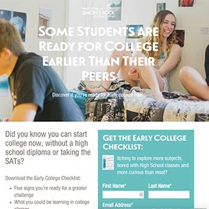
Most forms have a 2 column layout. Content is on the left and the form is on the right. Some forms have a hero graphic and use the Gatekeeper Layout.
- Mixed Media Form Example
- Mixed Media Form Example - Landing Page
- Mixed Media Confirmation Page with Media
Landing Pages
As seen above, Landing pages with forms should hide navigation.
Mixed Full
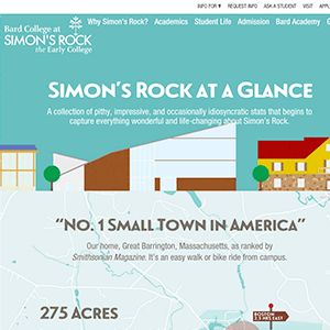
This template offers flexible full-width content. Use for highly designed pages that won't work in other templates. The original two pages have page-specific CSS. Light edits can be made via the WYSIWYG. Major edits need to be made to the source.
Page Parameters
- Secondary Nav
- Toggle hero between video and image
Edit
- Hero Content
- Content - Full width content, no rails (side margins)
Academics
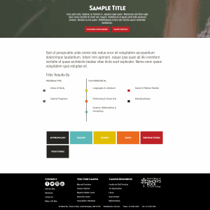
This template is used for highlighting our areas of study and special programs.
Page Parameters
- Toggle hero between video and image
- Toggle intro section
- Add intro text
Area of Study
This content area is dynamic and is not built on this page. It is compiled from the individual pages that utilize the Area of Study template. Set a division filter by adding code to the source footer.
<script>setTimeout(function(){ $('#languages').click(); }, 750);</script>
Area of Study
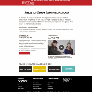
This template is used to highlight an area of study or special programs. Content appears on an area of study page as well as on other Area of Study Template pages and the Academic Template pages.
Page Parameters
- Toggle column 1 and 2
- Related Programs Heading (Heading 3)
- Select Related Programs by choosing an Area of Study page (Colored link boxes)
- Profile Content is not being used
Edit
Use 3 edit fields to build the unique page content.
Information
Describe the Area of Study. In general, a typical layout for Area of Study template would be as follows:
- Intro copy summarizing highlights
- Paragraph of additional summary
- Heading 3 Related Career Paths
- Paragraph listing related career paths
- Heading 3 Curriculum
- Heading 4 element
- Paragraph description of element
- Repeat #6 and #7 as necessary
- CTA - Browse Course Catalogue
- Heading 3 Course Spotlight
Column 1
Add a 550px wide image relevant to the course spotlight. This column can be toggled in the parameters.
Column 2
- Add a Heading 4 course title with Any - Margin Top Reduce from the styles dropdown.
- Add a paragraph course description.
This column can be toggled in the parameters.
MultiEdit
Set content for display on Academics Template pages.
- Toggle display
- Name
- Select Area of Study or Special Program
- Select Program Area
- Introduction gives a short description
- Select image 450px wide
- Image description
New Areas of Study
When making new pages, set display to none or put draft page in /training folder. Area of Study content display will be compiled into Academics pages even if the Area of Study page is unpublished.
Campus
Gateway
This template is used to introduce sub-audiences to a range of links. Gateway pages are used for the Info For links such as prospective parents, counselors, alumni, community members and current students and families. The gateway template makes common tasks easy to find by organizing groups of content.
Page Parameters
- Toggle hero between video and image
- Toggle Calendar on or off
- Add a Calendar heading
Main Content
In general, a typical layout for the Gateway template includes an Image List.
Gatekeeper
This template is used for landing pages with forms. The page has no navigation, encouraging users to fill out the form by reducing choices. The hero graphic adds an opportunity for compelling and prominent messaging.
Main Content
In general, a typical layout for the Gatekeeper will include:
- 2 columns
- First column: add class col-sm-6 row-col-highlight
- Inside first column: wrap text in a div with class text-wrapper
- Inside first column: add form asset
- Second column: add class col-sm-6
Master Section Landing
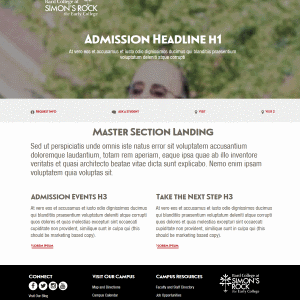
This template is used to introduce a range of high priority links. The Master Section Landing was designed for two pages admission pages. This template is differentiated from the Gateway by
- Links underneath Hero
- Body links get more of a setup (but not strictly built into template)
- No calendar
Page Parameters
- Toggle hero between video and image
Edit
- Hero
- Action Item Table Transformation
- Intro Content
- Main Content
Giving
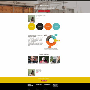
This template offers profile embeds and a trailing CTA section. Originally conceived as a one-off, but could be repeated if we ever get profile embeds off the ground.
Page Parameters
- Toggle hero between video and image
- Top Profile Link (or leave empty)
- Toggle Top Content
- Bottom Profile Link (or leave empty)
Edit
- Hero Content
- Main Content
- Highlight Content
Profile Full
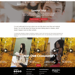
This template is used to highlight successful members of the Simon's Rock community. Use this template for profiles that include a hero graphic or video.
Page Parameters
- Toggle hero between video and image
- Toggle Intro on or off
- Add intro paragraph
- Toggle Sub Intro
- Path to Rocker Widget, displays at bottom of page
MultiEdit
MultiEdit content is output for external profile listings, including the Profile Rocker and Profile Slat. This view is shared with the Basic Profile Template.
- Title is Line 2 of the Profile Rocker.
- First Name and Last Name are combined for Line 1 of the Profile Rocker. Keep the name to 11 characters, otherwise it may be off on certain screen sizes. For privacy, students last names are often left blank.
- DO NOT USE the Rocker Link. There is a problem with the CTA text of the link.
Edit
In general, a typical layout for the Mixed Content template would be as follows:
- Hero
- Intro Copy (parameter)
- Sub Intro paragraph
- Main Content
Project Image with caption
Header and paragraph
Project image with - Additional Content
Pull Quote
Summary
CTA - Rocker Widget
Rocker Widget
Select
The carousel of profiles at bottom of page is controlled by the Rocker Widget. In parameters select which rocker widget.
New/Edit
Go to Parameters:
- "Rocker Heading" sets the text overlay
- Select profiles files ending in -rocker.inc, created by Profile template pages.
- Select 8 profiles
- Optional: add CTA button with text and URL
- To update single profiles, the profile must be published.
Profile Simple
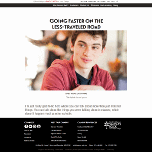
This template is used to highlight successful members of the Simon's Rock community. Use this template for profiles that don't include a hero graphic or video. This template requires an image. If there isn't an image, consider using a Mixed Media template.
Page Parameters
- Path to Rocker Widget, displays at bottom of page
MultiEdit
MultiEdit content is output for external profile listings, including the Profile Rocker and Profile Slat. This view is shared with the Full Profile Template.
- Headline is page headline
- Profile Image is the page image
- Title is displayed underneath the name on the page. It also displays as line 2 of the Profile Rocker.
- First Name and Last Name are combined. They display underneath the image on the page. It also displays as line 1 of the Profile Rocker. For the Profile Rocker, keep the name to 11 characters, otherwise it may be get off on certain screen sizes. For privacy, students last names are often left blank.
- DO NOT USE the Rocker Link. There is a problem with the CTA text of the link.
Edit
In general, a typical layout for the Mixed Content template would be as follows:
- MultiEdit Block
- Intro Paragraph (Intro Block)
- Sub Intro paragraph (Sub Intro)
- Main Content
Headline
Paragraph
Pull Quote
Paragraph
CTA - Rocker Widget (for instructions, see Profile Full)
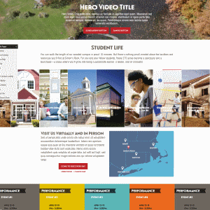
Student Life
This template offers full-width content in mid-page. The page kicks off with a hero, then a section with rails, full-width, and another section with rails. Designed for the Student Life section and full-width carousel, use for pages that need full-width content.
Page Parameters
- Toggle hero between video and image
- Toggle calendar
Edit
- Hero Video
- Intro Paragraph
- Carousel
- Main Content
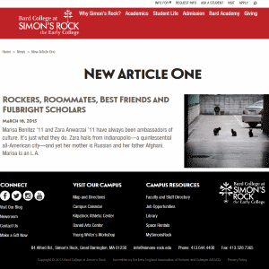
News Article
Pages created with this template easily sync with the News RSS feed. The page looks similar to the Mixed Media page.
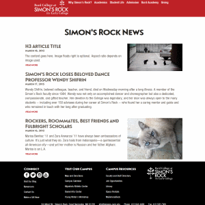
News Listing
This template displays the News RSS feed.
Page Parameters
- RSS Feed
- RSS Limit (more entries will increase page load)
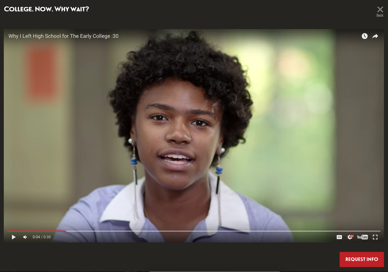
Video
Bio
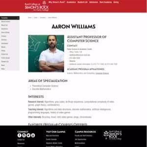
This is a sub-template. It's a mixed-media page (see above) with a specific format. Copy the Bio Template page and insert new information using the WYSIWYG edit field. Use this template for faculty bios. The section headings on the page should remain the same. If there is no information for a section the section can be removed. Karen Advokaat should be consulted prior to making changes.
Breadcrumbs should be on the page parameters. Sidenav should be left as is.
