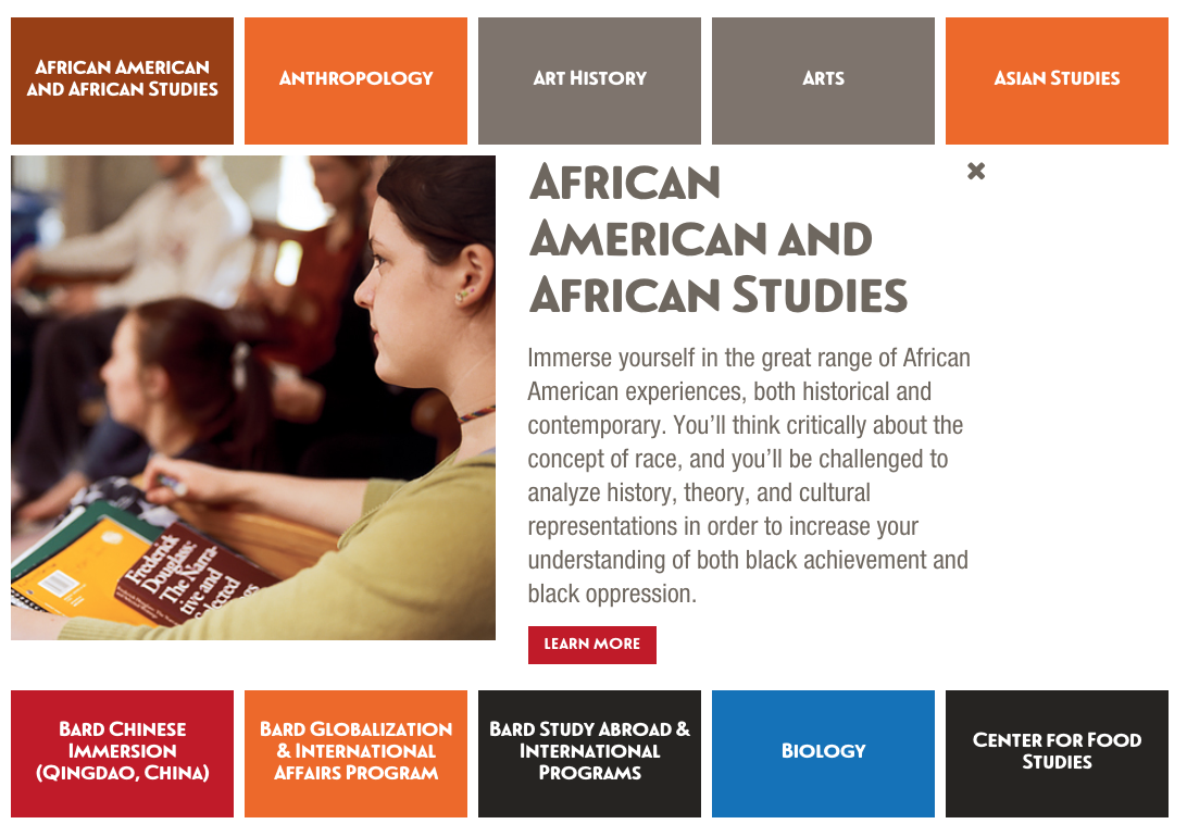
Academics Accordion
The academics accordion reduces conversions and should be removed.

With the accordion, selecting African American and African Studies reveals a short
description of the program.
Problem
Can we increase conversions from visits on Academics?
The strategy of the page is to demonstrate the breadth of areas of study and provide a quick preview. The accordion pattern enables users to quickly get a summary of the program. Selecting a program would reveal a description and the option to select a fuller description on a new page. Is this an effective pattern?
Test vs No Accordion
The version without an accordion had a higher page value, a higher rate of inquirers, and longer session duration.
Recommendations
- Remove accordion pattern.
- Optimize content
- Test areas of study page vs a more overview page about the academic programs.