Why Simon's Rock
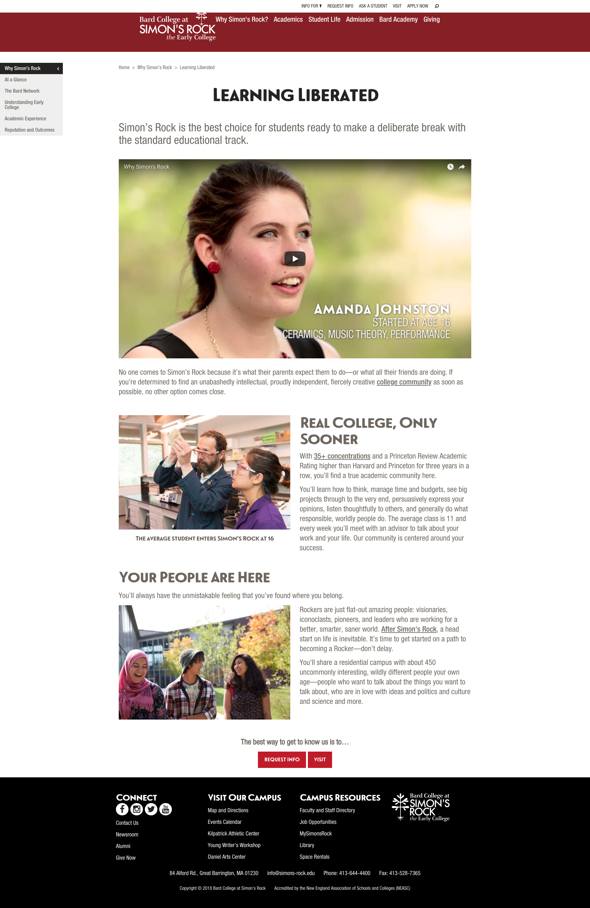
Several tests have confirmed the original design of Why Simon's Rock.
Problem
Can we increase conversions on Why Simon’s Rock?
The page is lengthy and the “Apply” button is the last panel. However, it is the button with the second highest number of clicks. This could suggest that people are ready to click to apply earlier on the page. If this is the case, an apply button higher up on the page may convert higher.
Test 1: CTA
Solution Parameters
A solution should increase Clicks to Apply while balancing for other goals as well as engagement.
Test
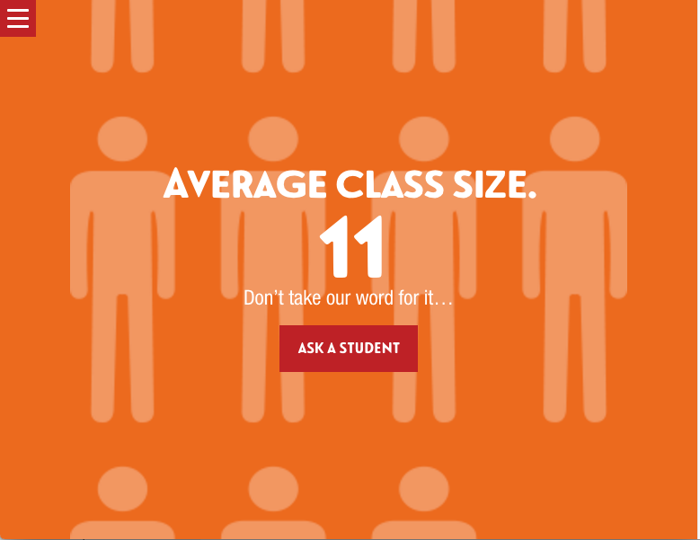
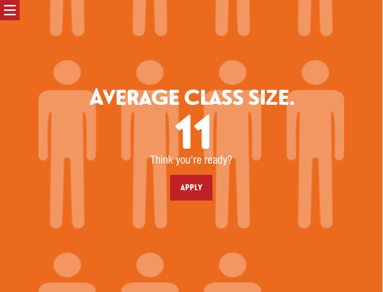
Replace the 6th Panel with an Apply Button
Result
The test with Apply Now in the 6th panel performed worse. It had less Clicks to App and less Inquiries. No change in the page will take place at this time.
Test 2: Layout
We tested the design against a more common layouts. There were 2 mixed media pages with alterate CTAs as well as a Hero graphic template.
Result
The control version won out against the three variations.
Recommendations
Try a variation where the mobile experience (no scroll jacking) is modeled for all devices.


