Application Selection
Problem
We have two separate 3rd party college admissions applications, each with it's own log-in. How do we encourage applicants to take the next step, provide necessary information, and make it easy for applicants to select the correct application?
Solution Parameters
A solution must:
- Make it easy for the user to get to the appropriate application
- Be implemented quickly
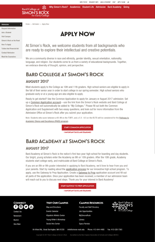
original version with paragraphs
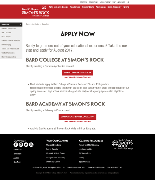
Reduced text with bullet points after the button
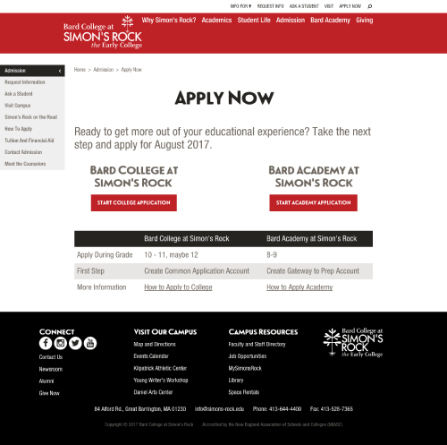
Side by side buttons with a shared table
Prediction
The prediction was that the most minimal versions would preform the best. Side by side comparison would be the strongest, and simpler with bullet points would be a slight improvement over the original.
Result
The side by side converts significantly higher than the other variations. The reduced text with bullet points performs worse than the original.