Above the Fold
Based on testing, consider ways to place the form higher up on the page.
BACKGROUND ISSUE
Should forms be visible above the fold (be visible to the user prior to scrolling)? On the one hand, sifting through information in order to get the form creates a barrier. On the other hand, people do scroll. In responsive design is there even a fold? Two recent tests on two landing pages found that moving forms higher up on the page significantly increased conversion rates. Yet, these tests are not evidence of a universal application.
5 Signs
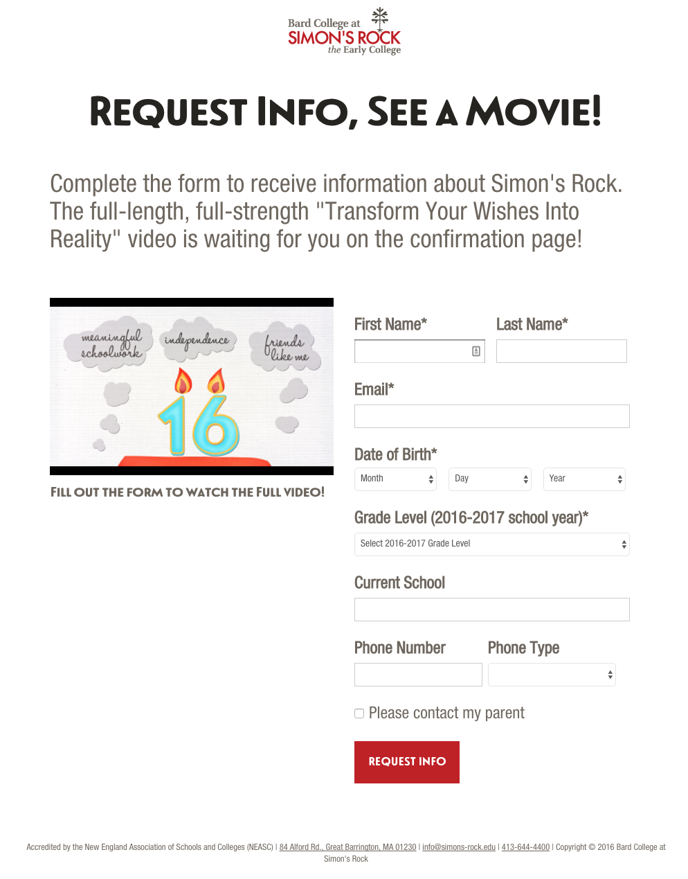
Search engine, web, and Facebook Ads send users to the 5 Signs lead generation form.
Initial

The initial version has a preview of the incentive above the form
Modified

Removing the preview and moving the form higher up the page increased form conversions.
Counter Examples
Removing content has it's limits. Removing the headline "Get the Early College Checklist" decreased conversions.
Adding content also has it's gains. Adding the hero image and headline increased conversions.
Email Landing Page
We purchase email lists and send emails to prospects and direct them to a landing page with a form.
Initial
The initial version has a copy prior to the form.
Modified

Moving the intro copy next to the form and moving the form higher up the page increased form conversions.