Small Form
Based on testing, reducing the size of individual elements is not helpful.
BACKGROUND ISSUE
The initial front-end design of the Request for Information (RFI) form featured slightly smaller elements. Due to a contradiction in the instructions between the front-end design team and the back end design team, the form was built with larger features. The front-end design form utilized a deviation from the Mixed Media template by removing a div class from a template-wide container. However, this deviation was never communicated to the back end team. The class triggered CSS functions that led to larger elements.
Test Solution
In December, 2015 a new version was developed that matched the original intent and was tested against the active version.
FORM VARIATIONS
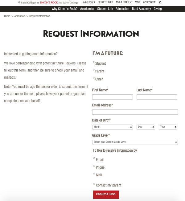
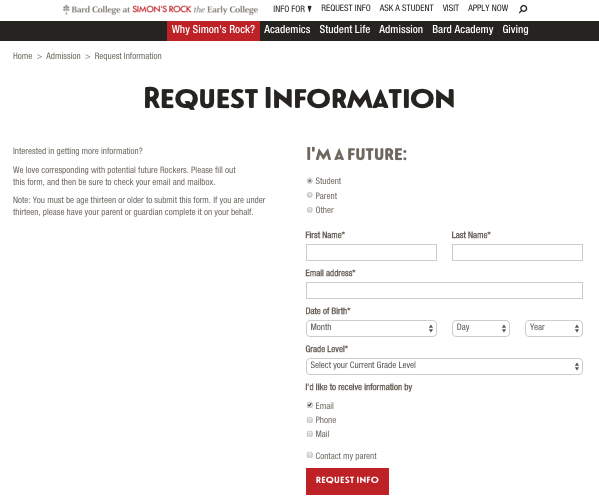
Here are examples of the two variations of the form. The modified form has smaller elements.
Initial
Smaller
TESTING SOLUTION
We ran an A/B split test where users were randomly served either the Initial or Modified
Version. This test was set to run until a variation had proven a better conversion
rate with 95% statistical accuracy.
PREDICTION
The prediction was that the smaller form would perform better. This was how the form was designed and seemed better than the accidental styling of the current form.
Result
The smaller form had a 50% decrease in inquiries. We will stay with the larger element format.

