5 Signs Design
The 5 Signs Form Landing Page should be optimized for the most effective design and form field options.
VERSIONS
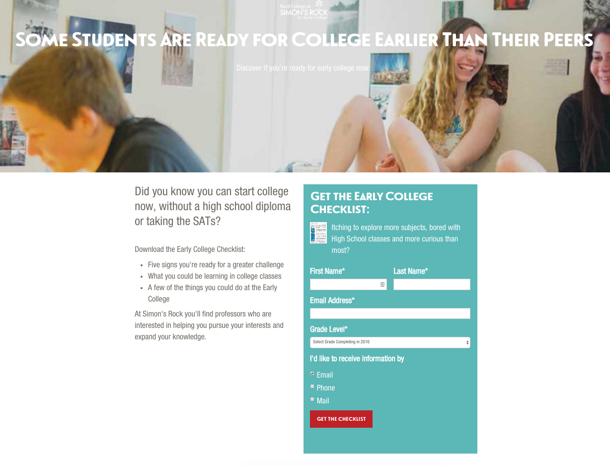
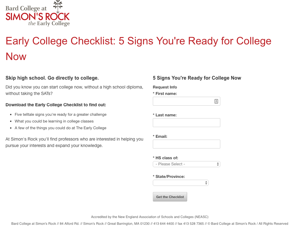
We compared three variations of the 5 Signs Form with varied results.
Variation 1
Original 5 Signs Form
Variation 2
New Design, Same Fields as Original

Variation 3
New Design, Same as Fields in RFI Form
We compared the three variations across two stages.
Test Solution
The coding of Variation 1 prevented Google Analytics Experiments from running. So we opted for a 100% traffic switch to Variation 2. Then compared numbers afterwards. We found Variation 2 led to moderate conversion rate increase and a significant decrease in bounce rate.
Next, we did an A/B Split test between Variation 2 and 3. Variation 2 had a significantly higher conversion rate .
Conclusion
Data suggests that Version 3, which includes the agreed upon RFI Fields, are not optimal for the 5 Signs Form. We should keep ‘Version 2’ as the default version for the 5 Signs Form.
- Impact Design: Version 2 uses the Gatekeeper Template and is much more thoroughly designed compared to Version 1 and it made a significant improvement.
- Field Details Matter: Version 2 and Version 3 have only slight difference, yet the conversion rate was significantly different. Perhaps, it was the language "I'd like to receive information by" which isn't appropriate for this specific incentive-based landing page.

